City Branding

Coat of Arms & City Shield


The official armorial bearings of the Corporation of the City of Sault Ste. Marie were granted by Governor General David Johnston on March 20, 2015. The blazon (or description of the elements) was approved by City Council July 15, 2013.
The coat of arms and motto is a distinguished and official symbol of the City with an elevated status that sets it apart from other elements of the City’s visual identity.
As a heraldic device it is intended for ceremonial applications only. Its use is restricted to key applications tied to the Mayor’s office such as the Mayor’s ceremonial stationery, Mayoral Chain of Office, proclamations, seals, selected souvenirs and executive gifts and the City’s Medal of Merit medal.
Local artist Eva Pilar-Cass was contracted by the Canadian Heraldic Authority to create the artistic rendition.
Coat of Arms Descriptions
Arms
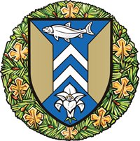
The shield has yellow-gold side sections and a blue center section composed of a vertical stripe that angles out at the top and bottom. On the stripe section are two white chevrons pointing upwards, one above the other, with a whitefish above and a white lily flower below them.
The arms are in the colours of the city and the background of the design makes reference to its most famous feature, the historic lock gates of the Sault Ste. Marie Canal.
The shape refers to the narrowing of the passage of water through the locks, and it also resembles the cross section of a steel girder, thus alluding to the steel industry that was an important part of the city’s history.
The whitefish is a species that has been found in great numbers in the Sault rapids.
The lily is a symbol of St. Mary and thus alludes to the city’s name; it also makes reference to city’s French heritage.
Crest
The Clergue Block House in Sault Ste. Marie, is set in place by a wreath of twisted cloth in gold and blue.
The Block House is a distinctive local building, and one of the oldest in the city. Originally a fur trade structure used by the Northwest Company, it was acquired and expanded by Francis H. Clergue, an American industrialist who developed the city’s industrial base in the 1890s.
Supporters
On either side of the shield is an Eastern, or timber, wolf in its natural grey colour, each holding the shaft of a hand crucible as used by steelworkers, in gold/yellow. They stand on a base of pine branches and gold or autumnal maple leaves, placed on white and blue waves from rapids.
The eastern or timber wolf is a powerful local animal known for its gregariousness. The crucibles, held by long shafts, are tools used by steelworkers to gather molten steel; as such, they provide another reference to the city’s steel industry heritage.
The base marks the significance of the local forestry industry, with the white-capped waves a reference to the Sault rapids.
The maple leaves indicate the city’s identity as a Canadian border municipality, their gold colour alluding to those in the coat of arms of Ontario.
Motto
This phrase “Ojibwe Gchi Gami Odena” in the Ojibway language appeared on the original emblem of Sault Ste. Marie. First Nations language experts confirmed the phrase to mean “settlement near the Ojibwe’s big lake”.
It appears that Sault Ste. Marie is the first municipality in Canada to incorporate a motto in Ojibway in its coat of arms.
City Shield

Created from elements extracted from the coat of arms, the City shield is wreathed in pine branches and gold maple leaves.
The shield is for use on official internal corporate documents such as Council reports and resolutions and other regulatory applications (building permits, Provincial Offences Act forms, vendor cheques, tax forms, etc.).
The words ‘The Corporation of the City of Sault Ste. Marie’ or ‘The City of Sault Ste. Marie’ must accompany the placement of the shield to identify the document as originating from the City.
City Flag
City Council approved a fresh new design for the City of Sault Ste. Marie flag in January 2016.
The City colours of gold and blue, which are predominant in the official coat of arms, are the principal colours of the flag.
The City’s “Naturally Gifted” emblem has been incorporated in the design, reflecting the mountains surrounding the City and the waters of both Lake Huron (lighter blue) and Lake Superior (darker blue).
The maple leaf is emblematic of our identity as an international border city and the colour of the maple leaf represents the majestic landscapes found in our district. The flowing design of the flag mirrors the flow of the St. Mary’s River.
Flag Raising Ceremony
On April 12, 2016, a flag raising ceremony was held at the Civic Centre to unveil the new design, in conjunction with the 104th anniversary of the incorporation of Sault Ste. Marie as a city.
Purchase a City Flag
Flags are available for purchase in the City Clerk’s office – Monday to Friday between 8:30 a.m. and 4:30 p.m., Level 4, Civic Centre.
Hoisting Flag
Hoisting flags are made from denier nylon fabric, complete with grommets and are available in 2 sizes.
- Size: 3′ x 6′ (height x width)
Cost: $50.85 including HST - Size: 4.5′ x 9′ (height x width)
Cost: $ 80.25 including HST
Desk Flag
- Size: 6″ x 4″ mounted on a 10″ black plastic pole with a single hole base. Cost: $4.15 including HST
If you have questions regarding the purchase of a flag, contact the Clerk’s office at 705.759.5388 or email cityclerk@cityssm.on.ca.